I’ve risked missing numerous flights because I lose track of time while paging through magazines in those airport bookstores. When I travel internationally, I always pick up the foreign edition of my favorite publications – even if I can’t understand the language, I like to see the cultural differences in typography, color choices and layout.
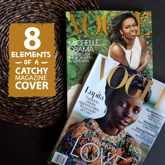
Needless to say, I love magazines. From time to time I end up hoarding way too many of them and I’m forced to sort through my stash and narrow it down a bit. As I waded through a pile of my favorite magazines from 2016, I noticed eight key elements that make magazine covers stand out.
1. MASTHEAD 2016 InStyle Magazine Covers 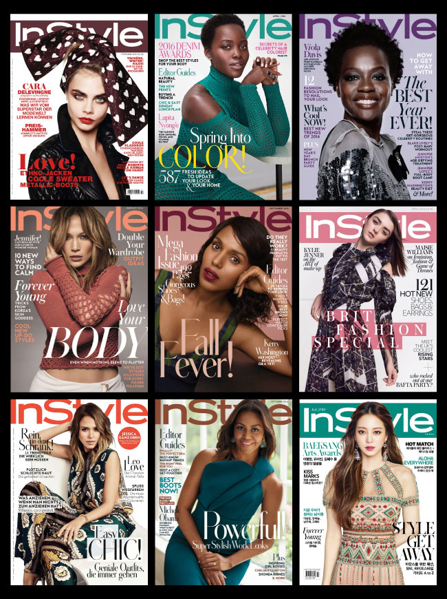
The masthead is the anchor of a magazine cover; essentially it’s the magazine’s logo or brand. The color may change, but the typeface, font size and placement usually remain the same so that the publication is easily recognizable. More established magazines have a bit more leeway when it comes to their mastheads. InStyle’s masthead is so well-known that it still connects with readers even if it is obscured by the cover model.
2.PHOTOGRAPHY 2016 Elle Magazine Covers
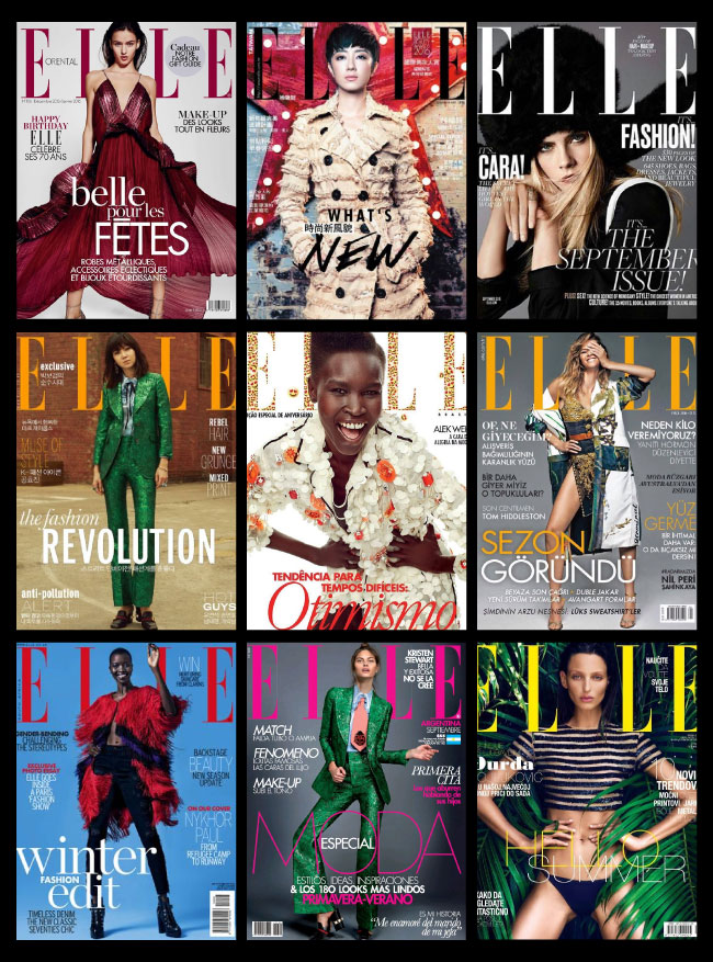
Great cover photography is what catches the reader’s eye and keeps the magazine current. Some magazines use similar photo compositions and crops from edition to edition while other publications like Elle keep things fresh and interesting by switching things up month-to-month. It’s been proven that photographs with direct eye contact make the most successful covers, but I’ve seen some killer non-traditional covers as well.
3.TYPOGRAPHY & HEADLINES 2016 Fast Company Magazine Covers
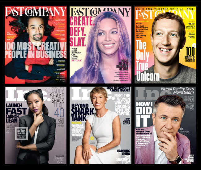
While images are a key element of a magazine cover, typography and text are of equal importance when it comes to connecting with readers. The typography treatment plays a major role in how information is presented to the reader. Creating effective visual hierarchies (through the use of color and font size variations) means key titles will always stand out and the most important information will be easy to find. Fast Company and Inc. magazines always do a great job of drawing the reader to their featured article through use of high contrast large fonts.
4.COLOR 2016 Vanity Fair Magazine Covers
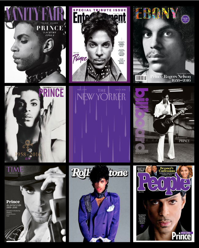
Using the right color combinations not only makes a cover pop, it also helps convey the mood, aesthetic and overall “feel” of a magazine. A bright yellow headline against a slate grey background is a surefire way to draw a reader’s eye to a featured article. Similarly, a dainty pink background decorated in kelly green font signals to customer’s that a publication is on-trend for Spring. There’s no doubt that striking color contrasts create attention grabbing combinations, but there are times when monochromatic color palettes make a huge impact as well. For example, the news stand was literally washed in shades of purple as the World mourned the death of Prince.
5. WHITE SPACE 2016 The New Yorker Magazine Covers
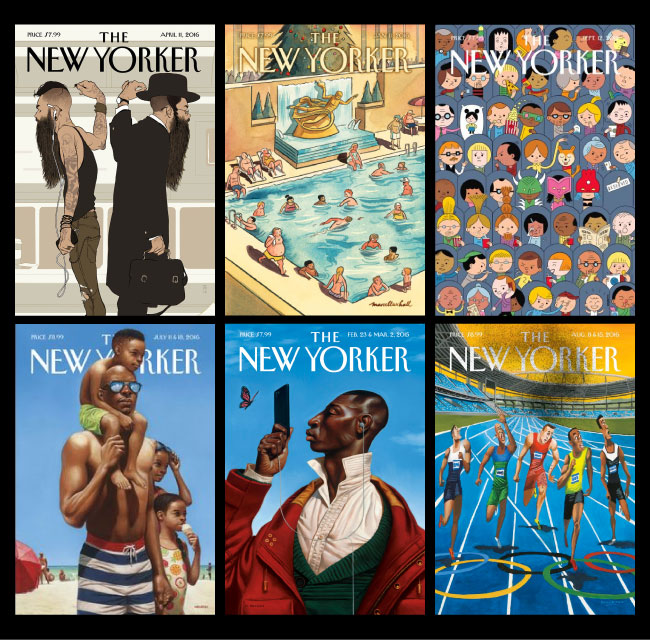
While it’s tempting to fill a cover with headlines to entice readers, it’s also important to maintain balance with “white space”. Cramming too much visual content on a cover can be overwhelming (and a big turn off to readers). The New Yorker is know for its colorful and intricate illustrations. The publication keeps their covers balanced by keeping cover typography clean and minimalist.
6. CONSISTENCY 2016 Fader Magazine Covers
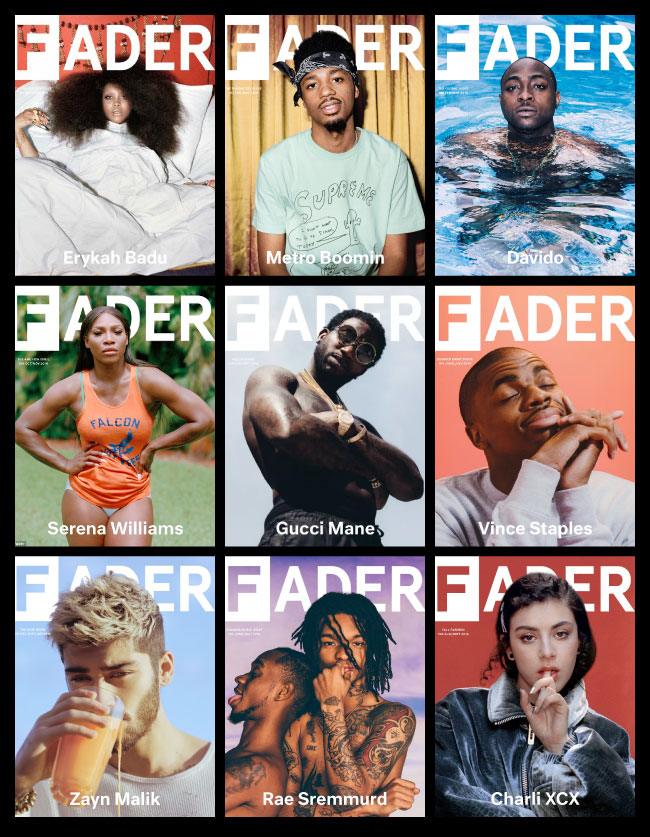
Consistency is crucial factor when cultivating a readership. It sounds boring, but it’s not. Successful magazines stick with a consistent style because they know that making changes too often will weaken their visual identity. Having cornerstone cover elements makes it easier for readers to focus on variable elements like cover photos and headlines. Fader does an amazing job, of making it’s covers pop in a predictable way.
7. KNOW YOUR MARKET 2016 Essence Magazine Covers
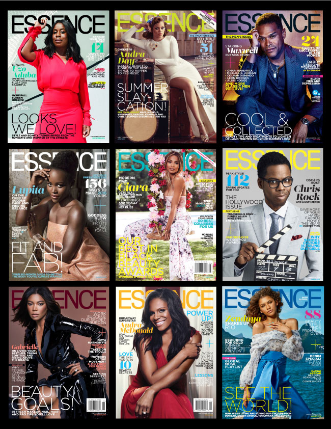
Understanding your audience is at the core of designing a cover that catches their interest. Essence magazine does a stellar job of connecting with African-American women by choosing models and headlines that address their needs. Knowing what your reader wants to see is only part of the equation, designing a cover in a way that makes that information visible is the other part of the equation. In the United States magazines are usually racked so that the top third of the magazine is the most visible, by contrast European magazines are usually displayed so that the left third of the magazine is visible. The placement of the masthead or key headlines may vary depending on where the magazine is sold. If you know your market you can adjust the cover design accordingly to ensure the most salient parts of the cover are easily visible.
8. SOCIALLY SHAREABLE 2016 Vogue Magazine Covers
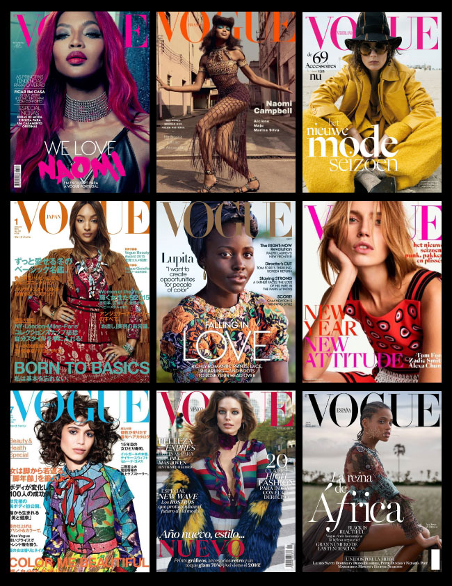
Last, but not least, push the boundaries! Choose bold punchy typography and provocative photos that draw attention to your publication. Vogue magazine is known for it’s legendary trend-setting covers. Vogue designs the type of covers that are often amplified because they make the rounds on social media perched on the desks or in the bags of top bloggers and taste makers.
I am looking forward to all the upcoming Spring magazine covers – I can’t wait to see what’s in store. What type of magazine covers do you like the most?
FOLLOW ME
 Multi-faceted Designer, Creative Director & Founder of SCOTCHBONNET! Accessories
Hi, I’m Velicia Hill Editor-In-Chief of Ms. Heel Magazine, the ONLY fashion mag that’s all about shoes & accessories. We recently launched and we’re looking to get our mag in the hands of bloggers like you that love magazines. We’d love to send you a copy and get your thoughts. We’d just need a mailing address. Please let me know if interested. BTW, LOVE this advice you gave–very informative.
Hi Velicia, thank you! Sounds good, I will email you.
i am thakful to sharing this amazing post
xvfznbhrfzb