The new Verizon logo – designed in partnership with Pentagram – is the company’s first brand update in 15 years. While it doesn’t appear that much has changed – in the eyes of a designer, removing the clunky “z” (to which a gradient was often applied) and re-positioning the check mark are two major visual upgrades.
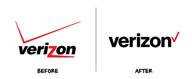
Stated simply: the new Verizon logo is cleaner and more modern. Unfortunately, Verizon’s introduction of the new logo to consumers was anything but simple.
The company released several esoteric and verbose statements explaining the ethos behind their new design. An excerpt from Verizon’s official announcement reads the updated logo is a “visual statement that honors our history and reflects an identity that stands for simplicity, honesty and joy”.
Really, Verizon?
Verizon’s official announcement goes on to celebrate the red checkmark seen by the company as “the universal symbol for getting things done which uniquely expresses the reliability of Verizon”.
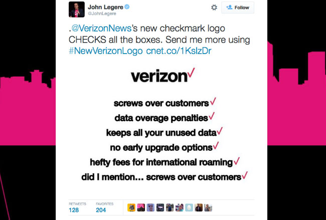
John Legere, CEO of competitor T-mobile, wasted no time sharing his thoughts on the new Verizon logo…and the checkmark in particular.
Google, on the other hand, took a pragmatic approach at explaining its refreshed logo. In a personable customer-focused blog post Google acknowledged that a great deal has changed since the original logo was created.
The company made particular note of the fact that Google (and it’s many digital services) are no longer accessed solely from a desktop PC. The updated Google logo and branding offers a visual solution for a World of seamless computing in which consumers access the brand across a variety of devices and through different types of input.
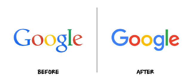
True to it’s mission of displaying optimally across a myriad of devices, the refreshed Google logo comes through clean and clear. Google’s updated logo also ushers in a new “identity family”.
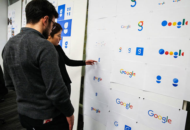
The identity family includes a collection of visual elements designed around the core logo. The elements can be used to pull the Google look and feel across a variety of apps and tools.
Like many, I was on the fence about the slanted crossbar in the “e”…until I saw the last ten seconds of this video!
The strong customer-centric approach Google used to unveil it’s updated brand elements was a winning strategy in my opinion. As a designer, there is nothing more rewarding than creating something that looks good and is intuitively embraced by it’s intended audience.
Sources: John Legere Twitter, Google Design
FOLLOW ME

 Multi-faceted Designer, Creative Director & Founder of SCOTCHBONNET! Accessories