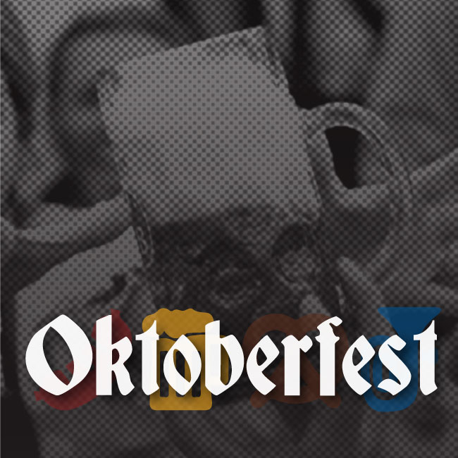
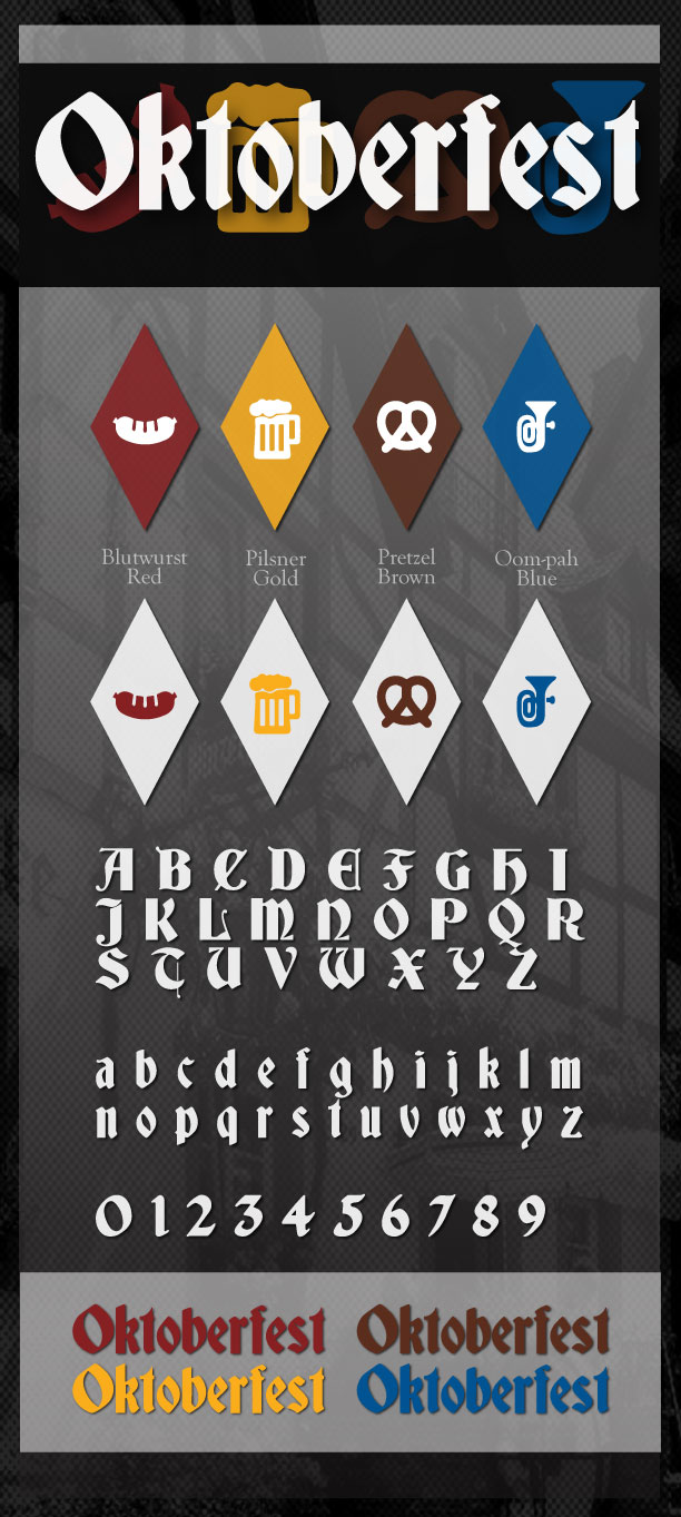
All things considered, I thought it would be apropos to do a brand board in honor of Oktoberfest, the festival of beer.
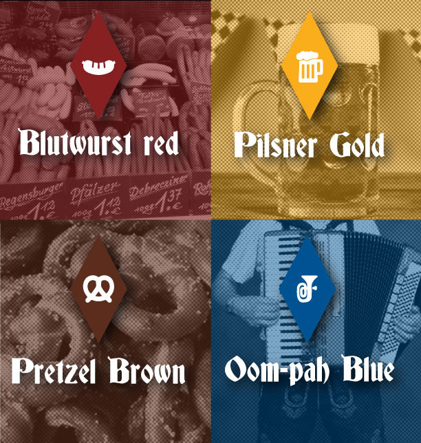
I chose a color palette that gives a nod to the tricolor German flag. I blended the classic hues of red, gold and black into fun shades that reflect the sights, smells and sounds associated with Oktoberfest. Since Bavarian Blue is an essential element of the culture, I rounded out the palette with a festive pop of blue for good measure.
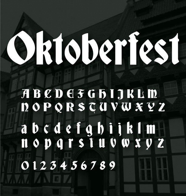
I searched for display fonts that embodied key elements of Old German Script – straight lines, sharp angles and strong Gothic stems. This one is a good choice because while it delivers those characteristics, it also has a slight modern curve which improves legibility (especially on digital devices).
Strike up the polka band…I’m ready to party!
*Fun fact: I spent a summer wearing a dirndl in the blazing Florida sun when I worked in Fantasy Land at Disney World! There may, or may not, be photographic evidence.
FOLLOW ME
 Multi-faceted Designer, Creative Director & Founder of SCOTCHBONNET! Accessories
Hi Tracey, love this! I was wondering if you would tell me what the name of that font is? I’m a fellow designer and I do a bunch of Oktoberfest stuff for the company I work for. We put on the only festivities in this small mountain town!
Hi Lucy, Thank you! The font is called Germania. Sounds like a fun job, I’d love to see some of your work.