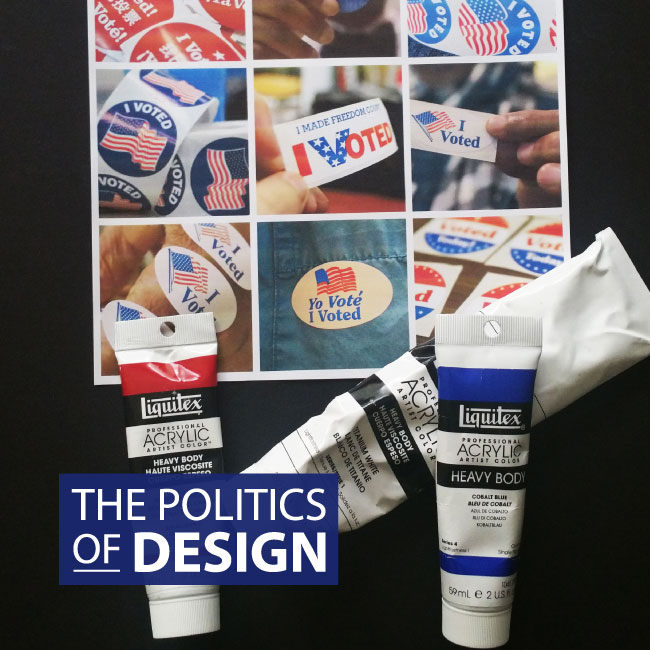
With that being said, this post is not (directly) about politics – it’s about design, with a little political snark thrown in for good measure. From the perspective of a designer the election season, and politics in general, are synonymous with: patriotic color palettes, stately authoritative fonts, and governmental graphic elements.
After months of listening to mudslinging speeches and seeing repetitive campaign ads, everything has become a blur of red, white and blue blabbering.
Considering all the channels candidates have to reach voters – television, websites, print, social media – building an identifiable brand that presents well across multimedia channels is more important now than ever before. Candidates who address their logo design as an afterthought (or farm it out to a family member who likes to “fool around in Photoshop”) put themselves at a considerable disadvantage.
President Obama’s campaign logo, designed by Sender LLC, burst on the scene in 2008 and revolutionized the face of American politics. Sender LLC, a Chicago based brand development and design company did a masterful job modernizing traditional campaign elements and infusing them with Obama’s personality.
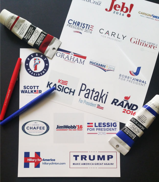
It seems the success of Barack Obama’s ground breaking logo inspired some of the 2016 candidates to try their hand at non-traditional branding. The results were “interesting”.
I won’t name any names, but the proceeding photograph may help you make an inference to whom I am referring. Here are a few branding backfires that I spotted during the most recent election cycle
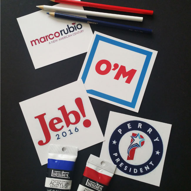
LOWERCASE FONTS
Yes, lowercase fonts are modern. They convey innovation and growth and they are literally all over the place here where I live in Silicon Valley. Think twitter, facebook and tons of other tech start ups. However, lowercase fonts don’t always translate well when it comes to political campaigns. Compared to traditional serif fonts or heavy weight modern type, lowercase fonts read as comical and novice – not the type of adjectives candidates want associated with their names.
MINIMALISM
Here’s the thing about minimalism; you need to build rapport with your audience before you earn the right to throw them a minimalist campaign logo. American voters know the golden and Mc Donald’s are one in the same and that swoosh mark is the calling card of the Nike brand. However, chances are pretty slim that voters will intuitively associate two letters with a somewhat obscure political candidate, especially when said candidate is in a primary pool with fifteen other candidates.
PUNCTUATION
If you have the nerve to use an exclamation point as part of your campaign logo, you absolutely must have the exuberance to back it up. If not, the irony of having an exclamation point as part of your campaign logo will only underscore your lack of charisma. I’ve said enough.
DESIGN ELEMENTS
Variations of stars, stripes, bald eagles and other patriotic symbols are commonplace in campaign logos. There’s a reason that political graphics usually fall within this realm. By pushing too far beyond these boundaries, candidates may risk being having their campaign branding confused with logos for sports teams or Popeye’s Chicken *cough, cough Rick Perry cough, cough*.
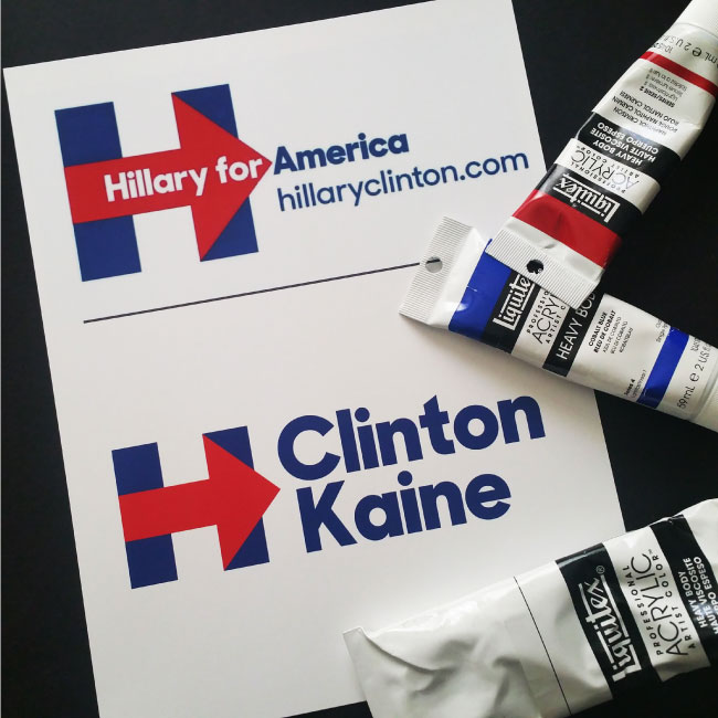
Candidates who receive his/her party’s nomination and advance beyond the primaries must expand their campaign branding to encompass the names of the Vice Presidential candidate.
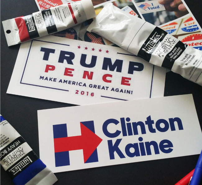
This was a smooth transition for Hillary Clinton. The bold “H” she used in her primary campaign, was simple and memorable. Her name was clear and legible, the red arrow suggested progress and literally pointed voters in the direction of her campaign message.
When Vice Presidential candidate Tim Kaine joined the ticket, she streamlined the her signature “H” and added “Clinton” and “Kaine” in balanced fonts to the right of the logo. Overall, her branding remained consistent throughout the primary and general election. Clearly, she had the foresight to plan ahead. Isn’t that a novel quality for a presidential candidate?
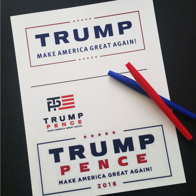
The road was rockier for the Trump campaign to add their Vice Presidential candidate’s name to their brash five star campaign logo. Less concerned with balance and harmony, the Trump campaign focused on ensuring the presidential candidate maintained a visually dominant position on all campaign materials. As if there was any doubt about who was running for president vs. vice-president, huh?
The initial joint ticket logo was comprised of a phallic looking “T” intersecting through a “P”. It pretty much left everyone wondering “What in the world that ‘T’ doing to the ‘P’…and were there any tic tacs involved“?
Realizing the mis-step, the campaign quickly found another way to keep the focus on Trump’s name; they did so by putting his name in “huge” letters above his running mate’s name. Now isn’t that classy and diplomatic?
As a designer (and an educated voter), I think campaign logos reveal quite a lot about the candidates and the political agendas they represent.
What do you think?
Make your voice heard in the comment section…and in the voting booth.
FOLLOW ME
 Multi-faceted Designer, Creative Director & Founder of SCOTCHBONNET! Accessories