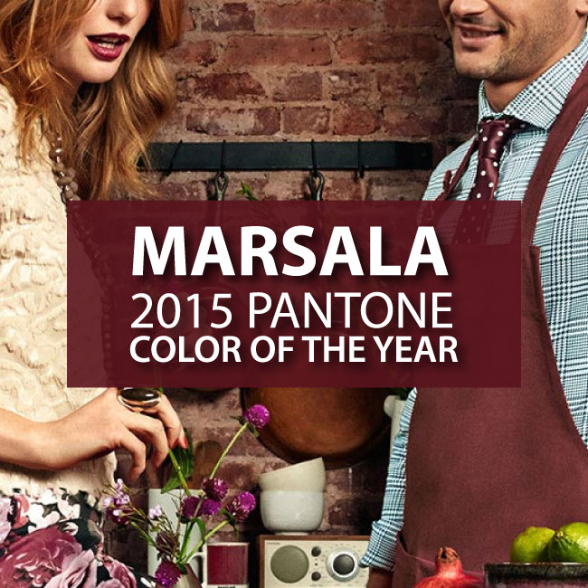
Honestly, I was completely underwhelmed when Marsala was named the 2015 Pantone Color of the Year. If there was such a thing as a “cyber side-eye” it would describe my reaction to Marsala when it starting flooding my Instagram feed shortly after the announcement. I mean in the wake of explosively gorgeous colors like Tangerine Tango (2012), Emerald (2013) and Radiant Orchid (2014); Marsala just seemed like a dud.
I didn’t feel a burst of inspiration or any excitement about incorporating it into current projects; I only felt indifference. Marsala was a cumbersome color to work into Spring and Summer design palettes because it lacks the exuberance and energy that those seasons embody.
Then fall came…and it was a different story.
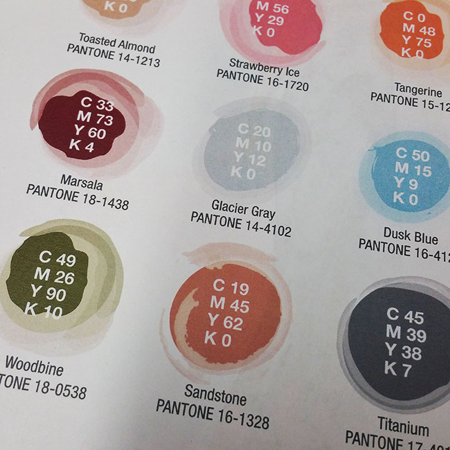
Marsala takes on a whole new meaning when it’s paired with earthy neutrals and moody blues. It blossoms into a warm, cozy robust color that begs to be used for everything from corporate logos to Holiday cards.
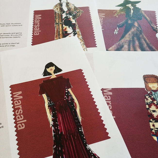
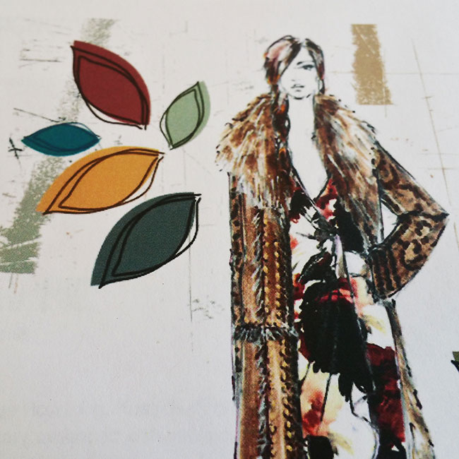
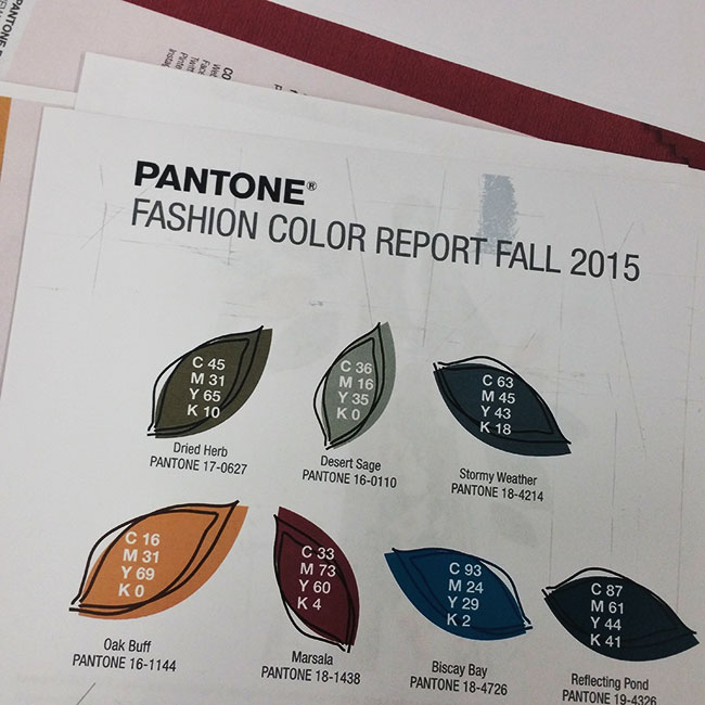
As the temperatures drop, I continue to warm up to Marsala especially after seeing the fashion sketches in the 2015 Pantone Fall Color Fashion Report .
Although we got off to a rocky start, we’re good now…sorry for being so judgmental, Marsala.
FOLLOW ME
 Multi-faceted Designer, Creative Director & Founder of SCOTCHBONNET! Accessories