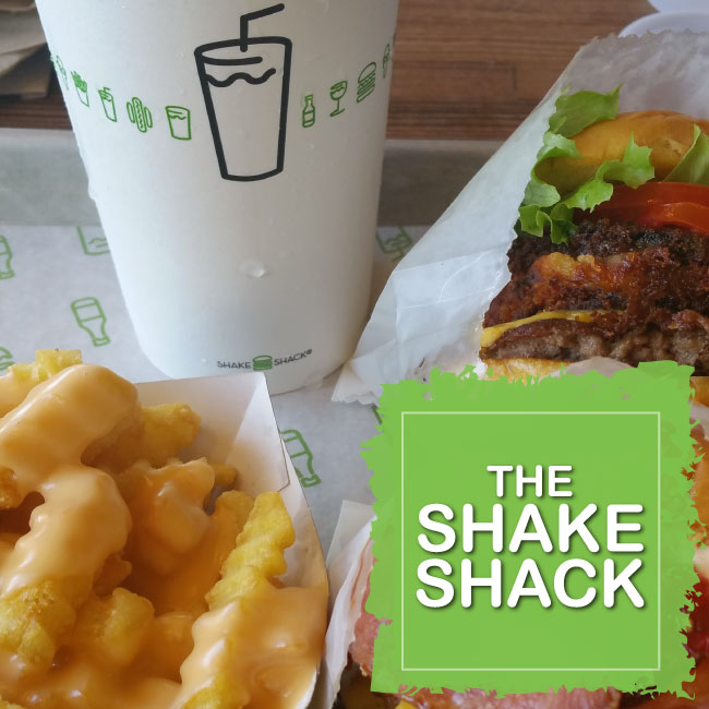
Such was the case when I was in Las Vegas and took a “gamble” on a burger place I’d never heard of. Among all the glitz, glam and flashing lights on The Strip; the simplicity of the Shake Shack logo jumped out at me so I went in to check it out.
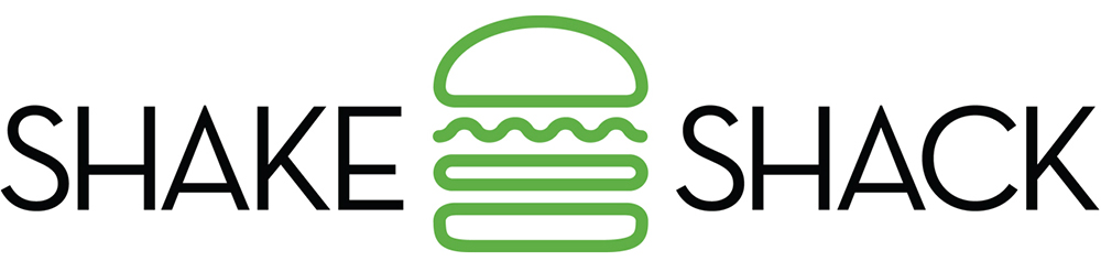
Apparently, I wasn’t alone. Shake Shack’s branding has caught the eye of customers across the globe – from New York to Moscow to Dubai and beyond. The burger joint’s distinctive logo, signage, bags and uniforms played a key role in building brand equity that resulted in a $1.6 billion dollar IPO when the restaurant chain went public.
What’s even more remarkable is that the branding project was initially taken on free of charge. Yes, you read that correctly. I’ll explain.
Principal designer Paula Scher, of Pentagram, was leading a pro bono identity redesign for the Madison Square Park Conservancy. While she was working on that project the Conservancy decided to construct a burger stand -Shake Shack- on the public premises. To ensure the burger branding didn’t clash with the rest of her project, Scher accpeted the Shake Shack branding project as an extension of her pro bono contract. Little did she know that one stand alone eatery would grow into an international burger chain.
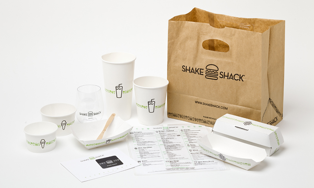
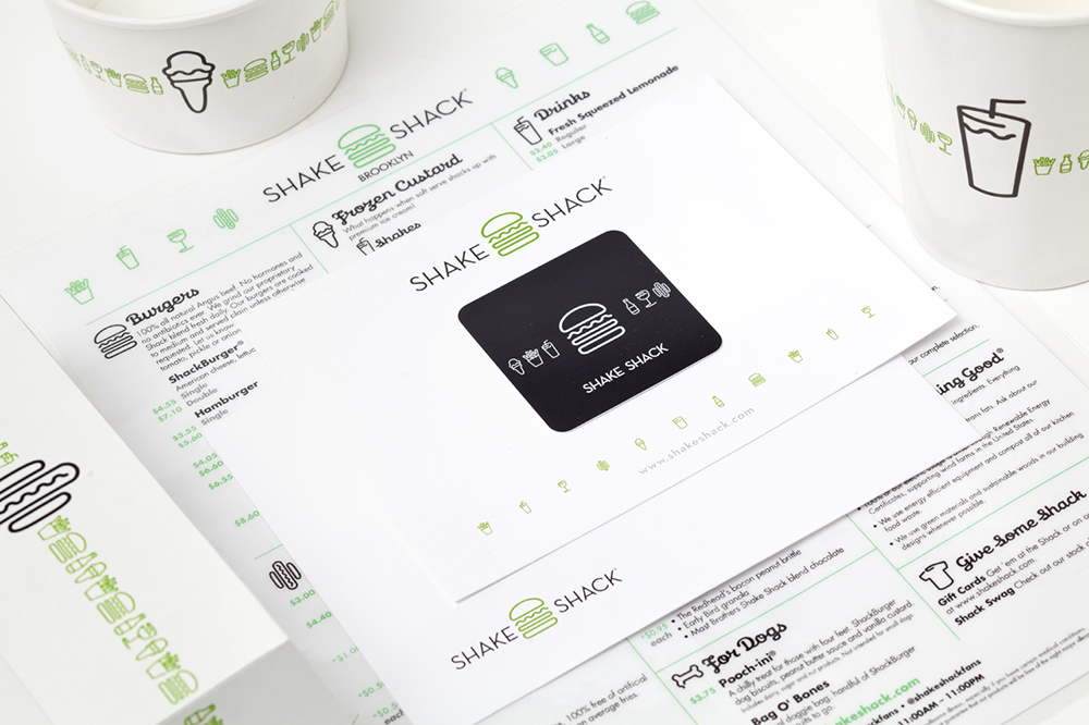
The Shake Shack’s brand aesthetic can be largely credited to two sources of inspiration. Firstly, to the architecture of the original establishment which was designed to blend within the park’s urban landscape. The signature metallic “Shake Shack” lettering in front of all their global stores is a nod to the corrugated metal elements in the original park location. Secondly, the branding was designed to re-imagine the classic 50’s burger joint with a modern twist.
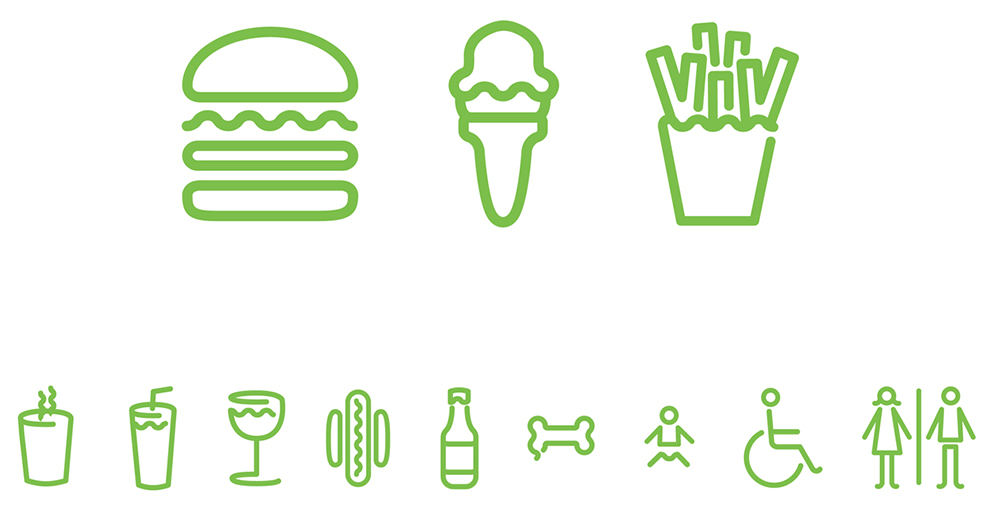
The font used on Shake Shack’s menus and bags gives off vibes of the neon signs used during the 1950’s. The theme is carried through the brand’s icons and illustrations which, although modern, are clearly inspired by classic neon signage from decades past. Using a zippy hue of green helped the original location blend in well with the park landscape; the color choice also conveys freshness and quality to an increasingly health-conscious consumer base.
Overall, the branding is: clean, catchy and distinctive.
Luckily for me, my initial “gamble” paid off since the food tastes just as good as the branding looks.
I still think fantasize about those crinkle cut cheese fries every now and then…
FOLLOW ME
 Multi-faceted Designer, Creative Director & Founder of SCOTCHBONNET! Accessories